
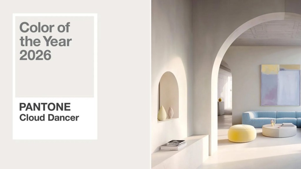
Pantone has announced its Color of the Year again, and this time it’s something called Cloud Dancer, which, near as I can tell, is white. Maybe off-white. Possibly “just-washed undershirt” white. But still white.
Now, don’t tell that to anyone who actually works with color. They’ll clutch their pearls (which I assume Pantone identifies as Seashell Mist #18-1210) and insist Cloud Dancer is not white but “a soft, elevated neutral evoking atmospheric serenity.”
I told a friend about this, and she nodded like she understood. “It’s a warm white,” she said.
I said, “Every T-shirt I own becomes warm white after three months. That’s not special.” She sighed the sigh people use when they realize you cannot be helped.
Women can detect 47,000 shades with precision so sharp it ought to qualify as a superpower. Men, meanwhile, operate with a color wheel that has roughly eight entries: red, blue, green, yellow, black, white, brown, and “whatever color that stain is.”
A man sees blue. A woman sees teal, turquoise, aquamarine, ocean foam, dusty peacock, winter lagoon, and “the exact color I want the bathroom painted except not quite.”
Ask a man to describe Cloud Dancer and he’ll say, “That’s white… or possibly eggshell.” Ask a woman and she’ll say, “It’s a luminous neutral with graceful lift.” A man hears “graceful lift” and thinks someone is describing a fancy elevator.
The other day, my friend held up two shirts and asked, “Do you like this one in raspberry or wine?”
I said, “Those are both red.”
She said, “They are not red. They are distinct.” Distinct is what women say when they want to remind you your eyeballs are decorative.
Meanwhile, Pantone introduces their Color of the Year with enough pomp and ceremony to make you think they’ve cured seasonal allergies. They issue statements. They release mood boards. They use words like “harmonize,” “balance,” and “reflective flux.” The last time I experienced reflective flux, I just needed sunglasses.
Still, in the name of open-mindedness, I tried to see Cloud Dancer the way Pantone intended. I stared at the swatch online. I tilted my head. I adjusted my screen. I blinked dramatically. And it remained … white.
Not magical white.
Not philosophical white.
Just … white.
Don’t get me wrong. I respect creativity. Ice cream companies do this beautifully. Moose Tracks. Rocky Road. Chunky Monkey. But if I ordered Cloud Dancer from a dessert menu, I’d expect whipped cream.
And it’s only with shades of white that people get this dramatic. Venture into the land of near-white and suddenly everyone becomes a poet. Off-white becomes “linen.” Slightly off-off-white becomes “vanilla dust.” Beige with ambition becomes “greige.” Whoever invented greige needs a long nap.
Maybe Pantone chose Cloud Dancer because we could all use something simple — a blank slate, a reset, a gentle color that neither offends nor confuses the public. Well, it confuses me, but in fairness, I once bought paint labeled “Summer Meadow” that turned out to be aggressive lime green.
So, yes, Cloud Dancer is classy. Elegant. Soothing.
But at the end of the day, it’s still white. Fancy white, maybe. Aspirational white. But white.
And if Pantone disagrees, they can explain it to my friend, who’s currently debating between painting her living room in Lagoon Breeze, Oyster Whisper or Misty Jade. Which, as far as I can tell, are all green.
But I’ve learned to keep quiet about that.

